Front cover:
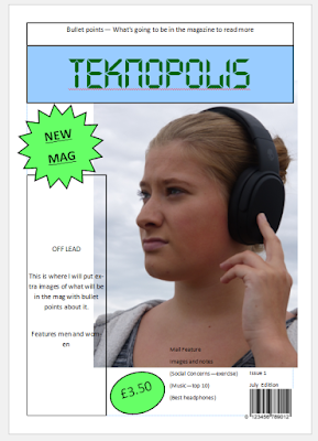
This is the plan for the front cover of my magazine. This will be the first issue of the magazine.
Firstly, I have learned when researching magazines that they are mostly stood on shelf in supermarkets. Then looking at magazines I noticed some put whats going to be in the magazine above the masthead. This will be to attract customers to the magazine so the best features need to be in that section. I have decided to take this idea and use it it my first issue of my magazine.
Next, when I have been researching magazines I noticed a lot of magazines use puffs. I noticed they stand out really well to the customer. Companies also use bold colours in order to show the puff off. I took this idea and used a light green colour to advertise the price and that it is a new magazine. As this is a plan i may change where these puffs are or the colour of them.
Next is the masthead. I decided on a tech sort of style font. This adds to my genre of my magazine. I decided to have it across the top as this will stand out more than in the top left hand corner which is in some magazines. I would like my main featured picture to be large. As this is a plan I am not sure if I will still use this photo or position this photo somewhere else. I would like my off lead to the side where it will have different listed features that is in the magazine and images next to them to represent what i am talking about. I am not yet sure on font or size yet for this.
Finally, I have also done the common things that are in a magazines. This being the bar code, issue date, issue number.
Contents:
This is my plan of my contents page of my first issue. I have researched different magazines to see how they represent their contents pages. As this is a plan I am not sure if I am sticking with this layout.
Firstly I have put the word contents in the top left hand corner. This has the same font as the masthead to keep with the brand identity. I am not sure if to keep it that small or stretch it more bigger across the top. At the top middle I have the issue number and month of the issue.
Next, I have added the puffs. I am not sure if I want to keep these at all or change the colour of them to more lighter red. These puffs are to advertise the main features and the other features in the magazine.
The main part of the contents is my features. I have Shown the top 5 features. I may put more of these to add more images but not sure yet. These are evenly spaced expect the 1st feature as this will be the top main feature of the magazine. This excluding the main cover. I have added diamond shapes which will have the page number inside. I am not fully sure if I will keep these shapes or just put the page number in the photo in a bold text. When researching magazines I have seen both styles.


No comments:
Post a Comment