Thursday, September 26, 2019

Planning: Issue 1 Front cover and Contents

Here is a simple plan made on publisher that I might want my magazine to look like these are first ideas that I might want to do.


Front cover:


This is the plan for the front cover of my magazine. This will be the first issue of the magazine.

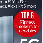
Firstly, I have learned when researching magazines that they are mostly stood on shelf in supermarkets. Then looking at magazines I noticed some put whats going to be in the magazine above the masthead. This will be to attract customers to the magazine so the best features need to be in that section. I have decided to take this idea and use it it my first issue of my magazine.

Next, when I have been researching magazines I noticed a lot of magazines use puffs. I noticed they stand out really well to the customer. Companies also use bold colours in order to show the puff off. I took this idea and used a light green colour to advertise the price and that it is a new magazine. As this is a plan i may change where these puffs are or the colour of them.

Next is the masthead. I decided on a tech sort of style font. This adds to my genre of my magazine. I decided to have it across the top as this will stand out more than in the top left hand corner which is in some magazines. I would like my main featured picture to be large. As this is a plan I am not sure if I will still use this photo or position this photo somewhere else. I would like my off lead to the side where it will have different listed features that is in the magazine and images next to them to represent what i am talking about. I am not yet sure on font or size yet for this.

Finally, I have also done the common things that are in a magazines. This being the bar code, issue date, issue number. 


Contents:


This is my plan of my contents page of my first issue. I have researched different magazines to see how they represent their contents pages. As this is a plan I am not sure if I am sticking with this layout.

Firstly I have put the word contents in the top left hand corner. This has the same font as the masthead to keep with the brand identity.  I am not sure if to keep it that small or stretch it more bigger across the top. At the top middle I have the issue number and month of the issue. 

Next, I have added the puffs. I am not sure if I want to keep these at all or change the colour of them to more lighter red. These puffs are to advertise the main features and the other features in the magazine. 

The main part of the contents is my features. I have Shown the top 5 features. I may put more of these to add more images but not sure yet. These are evenly spaced expect the 1st feature as this will be the top main feature of the magazine. This excluding the main cover. I have added diamond shapes which will have the page number inside. I am not fully sure if I will keep these shapes or just put the page number in the photo in a bold text. When researching magazines I have seen both styles. 


Friday, September 20, 2019

Research: Puffs in magazines

Puffs:


These are different style of puffs that are used in a magazine. They use simple words to attract customers to by the magazine as if they see  something interesting inside you will want to read more. So I will definitely using one of these. They also use bold colours to contrast to attract customers more if the magazine is on a shelf.


Research: Masthead fonts

Masthead Fonts

These are some masthead ideas I might use for my magazine:


These are some of mastheads that I might use. Some mastheads use capital letters and some magazines use a lower case font. They use quite bold font to stand out. I do like the "Tech" masthead where it is square blocks as it gives it a tech feel which I like. This goes with the theory of signs and signfiers as you want to give a meaning that people will give a  interpretation off. Also, the theory of Neale with repetition and difference so that people will know the brand identity of the magazine when it is released.

Thursday, September 19, 2019

Research: Gender in magazines

Gender representations in other magazines:


Female


This is stereotypical represented for a female to purchase this magazine. It has a pink background. This is typically young female colour. You have a female celebrity at a medium shot adding to a female representation of this magazine. You have the added extras of women's clothes that you can buy to get the look. This also makes women want to look like the celebrity by her looks and wears.

As I want to have both male and female genders in my magazine I will be taking this idea of the female magazine. I could take the idea of dressing up with a women's look. Or using the pink background as a font. As tech is normally a male look using these ideas will add the female look of using tech.


Male:


This is stereotypical represented for a male's to purchase this magazine. It uses a long shot of a male guitarist. That breaks convention by not looking into camera. The generally would be represent for younger males that enjoy music in the way to look like him and hoe to get his style. This has a much plainer background so this doesn't really represent anyone. Also, with the extra's they advertise in the magazine being more male stereotypical things like tattoos etc.

As I want to have both male and female genders in my magazine I will be taking this idea of the male magazine. I could take the ideas of they look.  As stereotypical males are more into tech the style and font and the wear he is dressed can be added into my magazine.


Other Gender:


This is stereo-typically represented as a more modern transgender feature on this TV guide. This is as the main feature is about an lezbien women. This medium close up portrays this well by putting her in the foreground and how she is dressed is more stereotypical manly than they would dress at that time. This is a contrast to the more stereotypical women in the background of what she wears and how delicate it is.

I could take the idea in this magazine for my magazine by using a different gendered person and how they are dressed and portrayed in a way so people know that they are of a different gender. As this is a old drama show I can take to much from it but deferinatly can tell how different she is shown.


Monday, September 16, 2019

Research: Launch of 1st issue magazine

1st issue of magazine


This magazine of How it Works is the first issue. 1st issue magazines are not really much different to normal magazines. They have a puff with the word "New." They have a sell line "The magazine that feeds minds." As there new magazine. I will be using this in my new magazine I create.

Extras on the magazine I like is the masthead as I like the font. With the gear and cogs on it to add to their brand identity.

They have lots of pictures to show what's in the new magazine. They have lots of contrasting colours and I like the added detail of science having a orange logo. Environment being green. Etc


Tuesday, August 20, 2019

Research: 16-25 concerns

Concerns for the TA:


I am researching the concerns of our target audience of 16-25


Mental Health:


PTSD - The overall prevalence rate for a diagnosis of PTSD. It was much higher in young people and adults aged 16-24 years with 5% of young men and 4% of young women likely to screen positive for PTSD.

Depresssion and anxiety- The adult psychiatric morbidity survey completed in 2007 indicated that 16% of young people aged 16-24 met the criteria for diagnosis with a common mental health condition such as depression and anxiety.

Self-harm - Reports of self-harm were highest for young people of both sexes in the 16-24 age group.

Suicidal thoughts


For mental health there is a lot more conditions that affect 16-25 who need support e.g eating disorders etc.

Social concerns:

The top most social concerns that people ages 16-25 face people today

1. Lack of employment opportunities
2. Failure to succeed in education system
3. Family problems
4. Substance abuse
5. Pressures of materialism
6. Lack of affordable housing
7. Negative stereotyping
8. Pressures of 24-hour social networking
9. Crime

Saturday, August 10, 2019

Research: Synergy and brand identity (2)

Synergy and brand identity:


Brand identity is used through out a magazine, contents page of the magazine and website. The entertainment magazine I have chosen to see the difference in these is TV Choice.


This is the front cover of the TV Choice magazine. This magazine does not break any conventions as it has barcodes, features and the main feature looking into camera. They use a range of different colours that match well together. For example the small featured shows at the bottom of the front cover the title for example The Bay is in a bold orange font. This is matched with a orange rim around the new show to separate the others. The main feature with the headline "Tragedy" is in a yellow font with a blue outline these colours contrast well. Although this can of breaks conventions as "Tragedy" is bad you would think of red colour. The masthead is a red background with white text with is quite common in entertainment magazines.

This entertainment magazine has no contents page inside. As magazines as a whole his could break the convention but as the genre of magazine being a TV Guide it might not need a contents page as much.


This the whole of the TV Choice homepage when you click onto it. It is very simple and not much to it at all. I does match with the brand with the blue background and the masthead being te same in the top left corner. The front page has adverts down the side, a preview of the new issue and extras like be on tv and competitions. It does have a orange navigation bar at the top but this jsut leads you to competitions section, awards and contact us. This is very similar to whats on the homepage but jsut another way o get to them.